Creating art for a movement
Unified Sports & Inclusion Center - Building Artwork
Special Olympics Michigan · Grand Rapids, MI · 2025-26
It's not every day you're handed a big canvas. Like, a really big canvas.
Alchemy Creative has supported the Special Olympics movement for years — not just as a vendor, but as genuine believers in what the organization stands for. So when Special Olympics Michigan President & CEO Tim Hileman reached out in November 2025 with an idea for the Unified Sports & Inclusion Center (USIC) in Grand Rapids, we didn't hesitate.
The ask: design large-scale artwork for one of the world's premier Special Olympics training facilities. Graphic design is a smaller part of what we do at Alchemy, but this was the kind of brief you take a shot at — or at the very least, be brave enough to attempt. We had previously designed a history wall for the organization, and this project was an invitation to expand on that work in a much bigger way.
There was just one catch: the concept had to be pitched, approved, and in production in time for a major SOMI event in early March. That's a tight window for any project — let alone one covering the walls of a facility this size.
The Challenge
Three constraints shaped everything from the start.
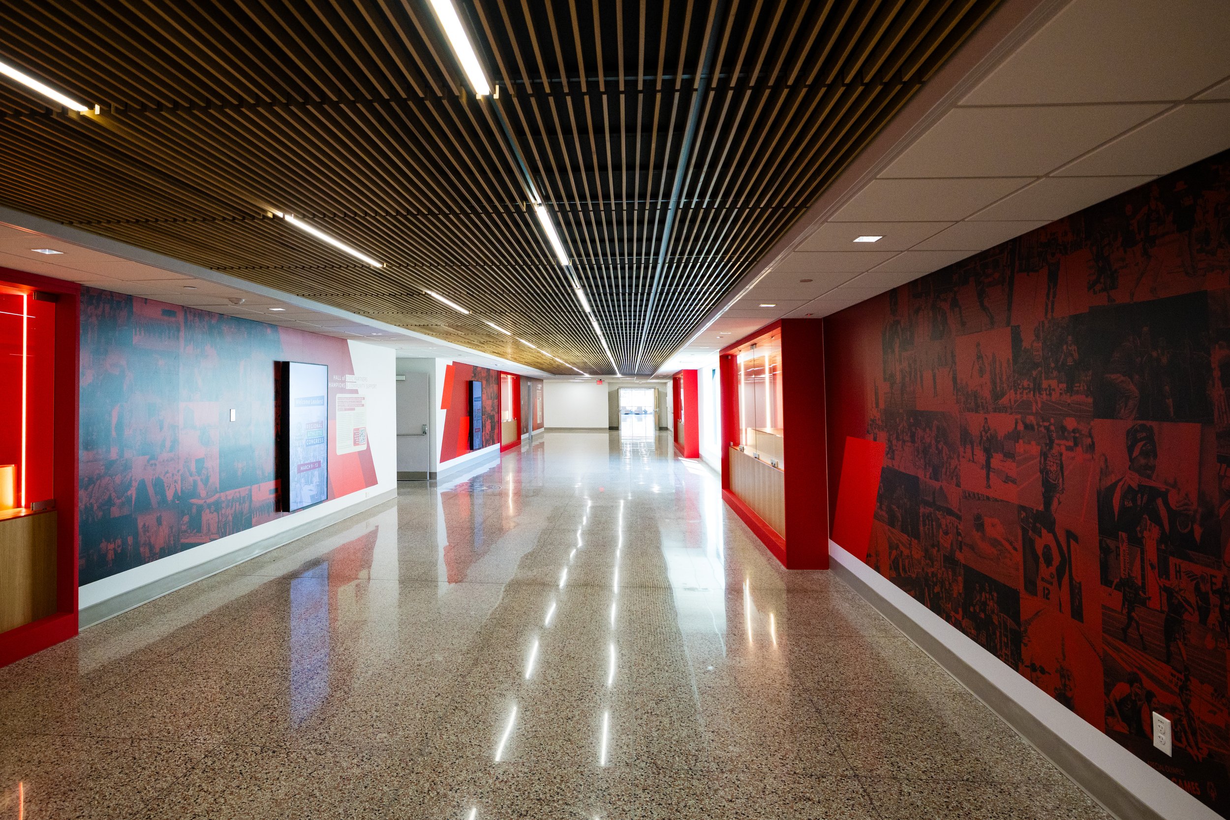
The sheer scale of the space demanded artwork that could hold its own — nothing timid would work on walls this large.
The organization knew the content would need to evolve over the next decade, reflecting new award winners and shifting demographics, but this was a one-time physical installation. That meant building in flexibility without relying on the ability to reprint.
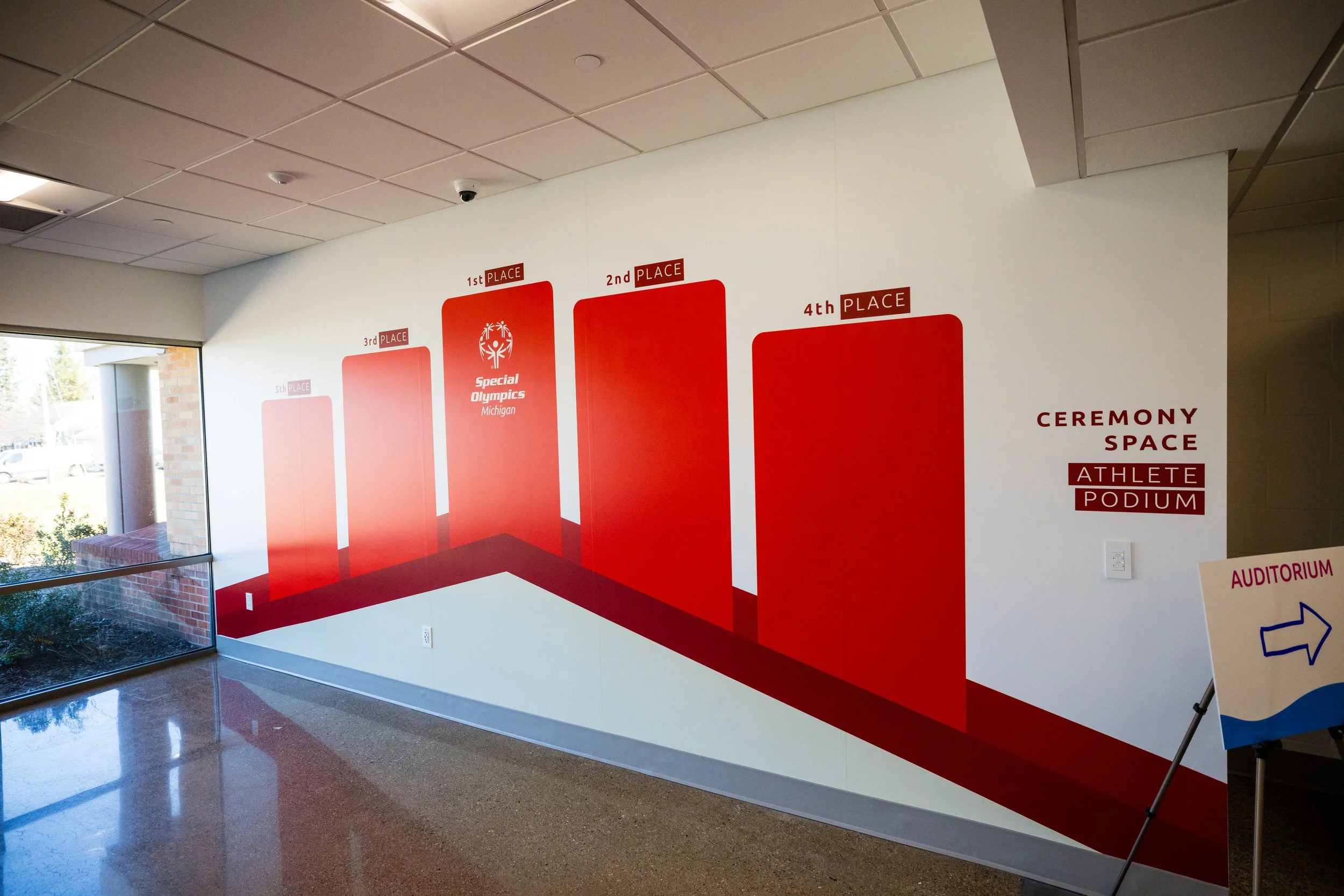
The client wanted the space to be genuinely interactive — not just something you walk past, but something you engage with.
"Wouldn't it be cool if..." — that's where every good idea in this project started. We kept asking that question until the space told us what it wanted to be.
The Approach
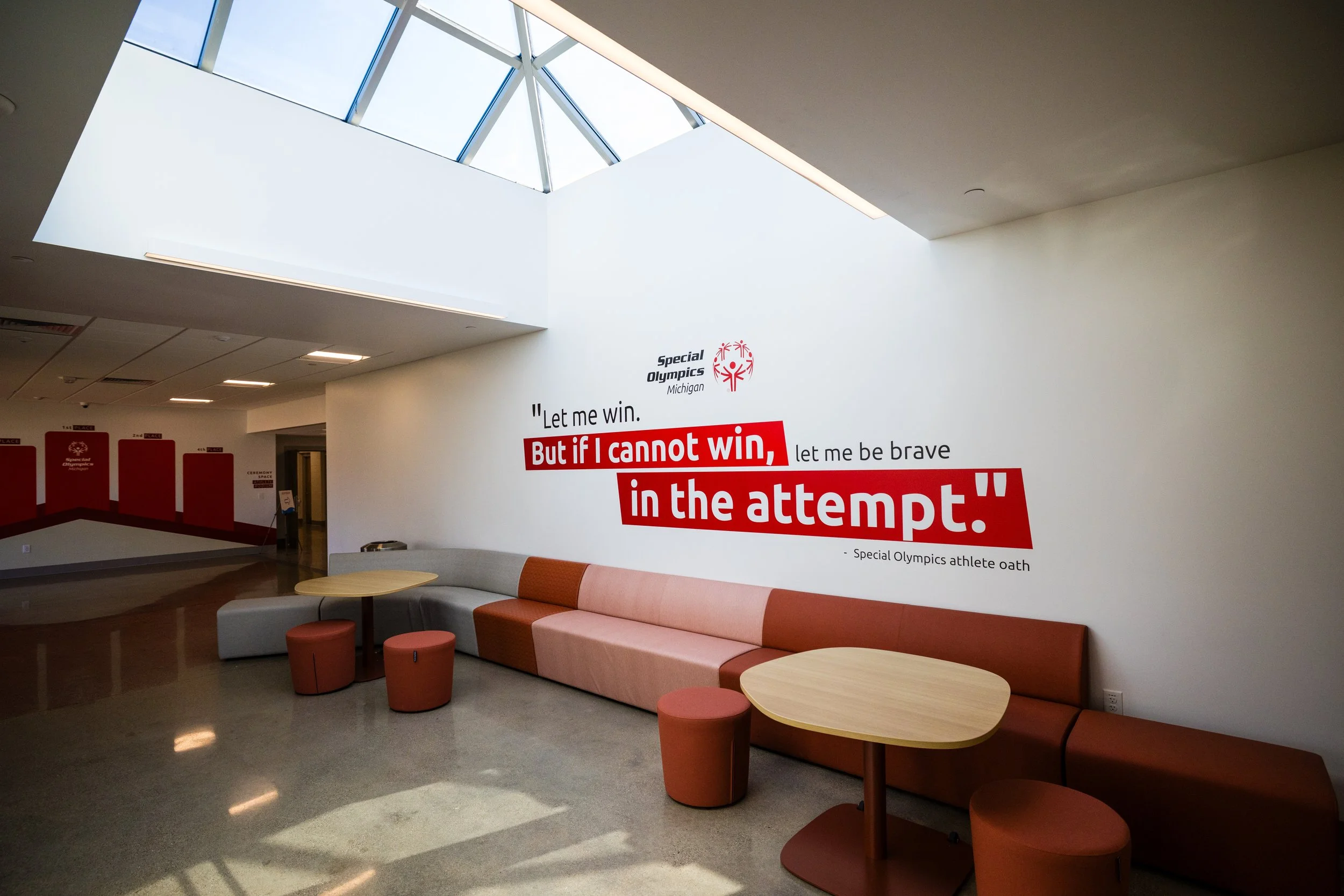
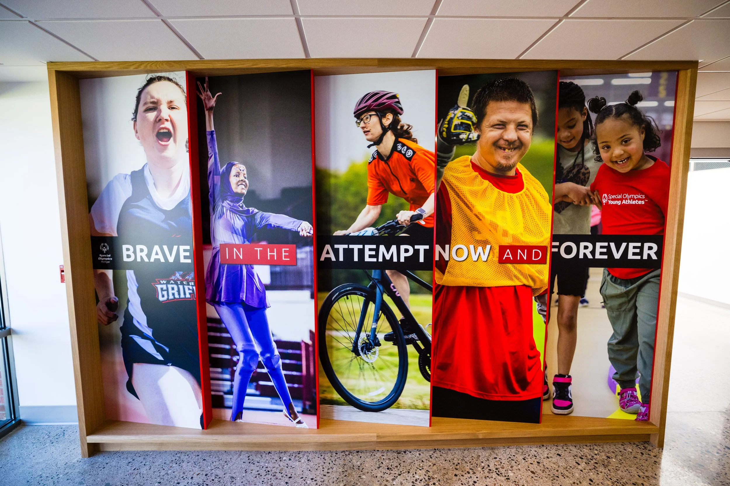
We grounded the design in bold, full color — fully committed to the Special Olympics brand palette, saturated in SO Red — and let it fill the space without apology. The goal was to make the room feel alive, polished, and like there was some intentionality behind the designs, not like a corporate hallway with some random graphics on the wall. The human element became central. Special Olympics Michigan's strength is its people: athletes, coaches, volunteers, and staff who make the movement what it is. We designed the artwork to highlight as many of those faces and stories as possible, giving the space a sense of community rather than institution.
For the interactive components, we leaned into what the space is actually used for. Selfie stations give visitors a way to make the space their own. An indoor medal podium invites people to step up — literally. QR codes embedded throughout allow the content to evolve digitally even as the physical installation stays fixed, solving the longevity challenge in a way that doesn't require a reprint every few years.
Three main lessons learned:
It takes a village. From a bunch of rapid conversations, this installation became an amalgamation of concepts, ideas, and half-baked thoughts from a lot of sources. The team that worked on this project all contributed and made the ideas better with each iteration.
Speed demands trust. From first conversation to installation, the timeline was razor-thin. That kind of pace only works when the client trusts the creative team to make strong decisions without excessive revision cycles. Huge thanks to our Special Olympics Michigan client for being with us to run with it.
Design for what you can't predict. A permanent installation serving an evolving organization is a design problem, not just an aesthetic one. The QR code integration wasn't just a nice touch — it was the answer to a real constraint. When the physical can't change, make the digital do the heavy lifting.
The Team
Client: Special Olympics Michigan — Tim Hileman & Jen VanSkiver
Chief designer: Bo Parker
Collaborators: Madeline Safrit, Aaron Mills, Kayla Fox-Kucz, Jesi Ekonen
Production: Midwest Signs & Co